Following up on my previous post, I tried the regression approach for predicting future snow depth from current values. As you recall, I produced a plot that showed how much snow we’ve had on the ground on each date at the Fairbanks Airport between 1917 and 2013. These boxplots gave us an idea of what a normal snow depth looks like on each date, but couldn’t really tell us much about what we might expect for snow depth for the rest of the winter.
Regression
I ran a linear regression analysis looking at how snow depth on November 8th relates to snow depth on November 27th and December 25th of the same year. Here’s the SQL:
SELECT * FROM (
    SELECT extract(year from dte) AS year,
        max(CASE WHEN to_char(dte, 'mm-dd') = '11-08'
                 THEN round(snwd_mm/25.4, 1)
                 ELSE NULL END) AS nov_8,
        max(CASE WHEN to_char(dte, 'mm-dd') = '11-27'
                 THEN round(snwd_mm/25.4, 1)
                 ELSE NULL END) AS nov_27,
        max(CASE WHEN to_char(dte, 'mm-dd') = '12-15'
                 THEN round(snwd_mm/25.4, 1)
                 ELSE NULL END) AS dec_25
    FROM ghcnd_pivot
    WHERE station_name = 'FAIRBANKS INTL AP'
        AND snwd_mm IS NOT NULL
    GROUP BY extract(year from dte)
    ORDER BY year
) AS sub
WHERE nov_8 IS NOT NULL
    AND nov_27 IS NOT NULL
    AND dec_25 IS NOT NULL;
I’m grouping on year, then grabbing the snow depth for the three dates of interest. I would have liked to include dates in January and February in order to see how the relationship weakens as the winter progresses, but that’s a lot more complicated because then we are comparing the dates from one year to the next and the grouping I used in the query above wouldn’t work.
One note on this analysis: linear regression has a bunch of assumptions that need to be met before considering the analysis to be valid. One of these assumptions is that observations are independent from one another, which is problematic in this case because snow depth is a cumulative statistic; the depth tomorrow is necessarily related to the depth of the snow today (snow depth tomorrow = snow depth today + snowfall). Whether it’s necessarily related to the depth of the snow a month from now is less certain, and I’m making the possibly dubious assumption that autocorrelation disappears when the time interval between observations is longer than a few weeks.
Results
Here are the results comparing the snow depth on November 8th to November 27th:
> reg <- lm(data=results, nov_27 ~ nov_8)
> summary(reg)

Call:
lm(formula = nov_27 ~ nov_8, data = results)

Residuals:
    Min      1Q  Median      3Q     Max
-8.7132 -3.0490 -0.6063  1.7258 23.8403

Coefficients:
            Estimate Std. Error t value Pr(>|t|)
(Intercept)   3.1635     0.9707   3.259   0.0016 **
nov_8         1.1107     0.1420   7.820 1.15e-11 ***
---
Signif. codes:  0 ‘***’ 0.001 ‘**’ 0.01 ‘*’ 0.05 ‘.’ 0.1 ‘ ’ 1

Residual standard error: 4.775 on 87 degrees of freedom
Multiple R-squared:  0.4128,    Adjusted R-squared:  0.406
F-statistic: 61.16 on 1 and 87 DF,  p-value: 1.146e-11
And between November 8th and December 25th:
> reg <- lm(data=results, dec_25 ~ nov_8)
> summary(reg)

Call:
lm(formula = dec_25 ~ nov_8, data = results)

Residuals:
    Min      1Q  Median      3Q     Max
-10.209  -3.195  -1.195   2.781  10.791

Coefficients:
            Estimate Std. Error t value Pr(>|t|)
(Intercept)   6.2227     0.8723   7.133 2.75e-10 ***
nov_8         0.9965     0.1276   7.807 1.22e-11 ***
---
Signif. codes:  0 ‘***’ 0.001 ‘**’ 0.01 ‘*’ 0.05 ‘.’ 0.1 ‘ ’ 1

Residual standard error: 4.292 on 87 degrees of freedom
Multiple R-squared:  0.412,     Adjusted R-squared:  0.4052
F-statistic: 60.95 on 1 and 87 DF,  p-value: 1.219e-11
Both regressions are very similar. The coefficients and the overall model are both very significant, and the R² value indicates that in each case, the snow depth on November 8th explains about 40% of the variation in the snow depth on the later date. The amount of variation explained hardly changes at all, despite almost a month difference between the two analyses.
Here's a plot of the relationship between today’s date and Christmas (PDF version)
The blue line is the linear regression model.
Conclusions
For 2014, we’ve got 2 inches of snow on the ground on November 8th. The models predict we’ll have 5.4 inches on November 27th and 8 inches on December 25th. That isn’t great, but keep in mind that even though the relationship is quite strong, it explains less than half of the variation in the data, which means that it’s quite possible we will have a lot more, or less. Looking back at the plot, you can see that for all the years where we had two inches of snow on November 8th, we had between five and fifteen inches of snow in that same year on December 25th. I’m certainly hoping we’re closer to fifteen.
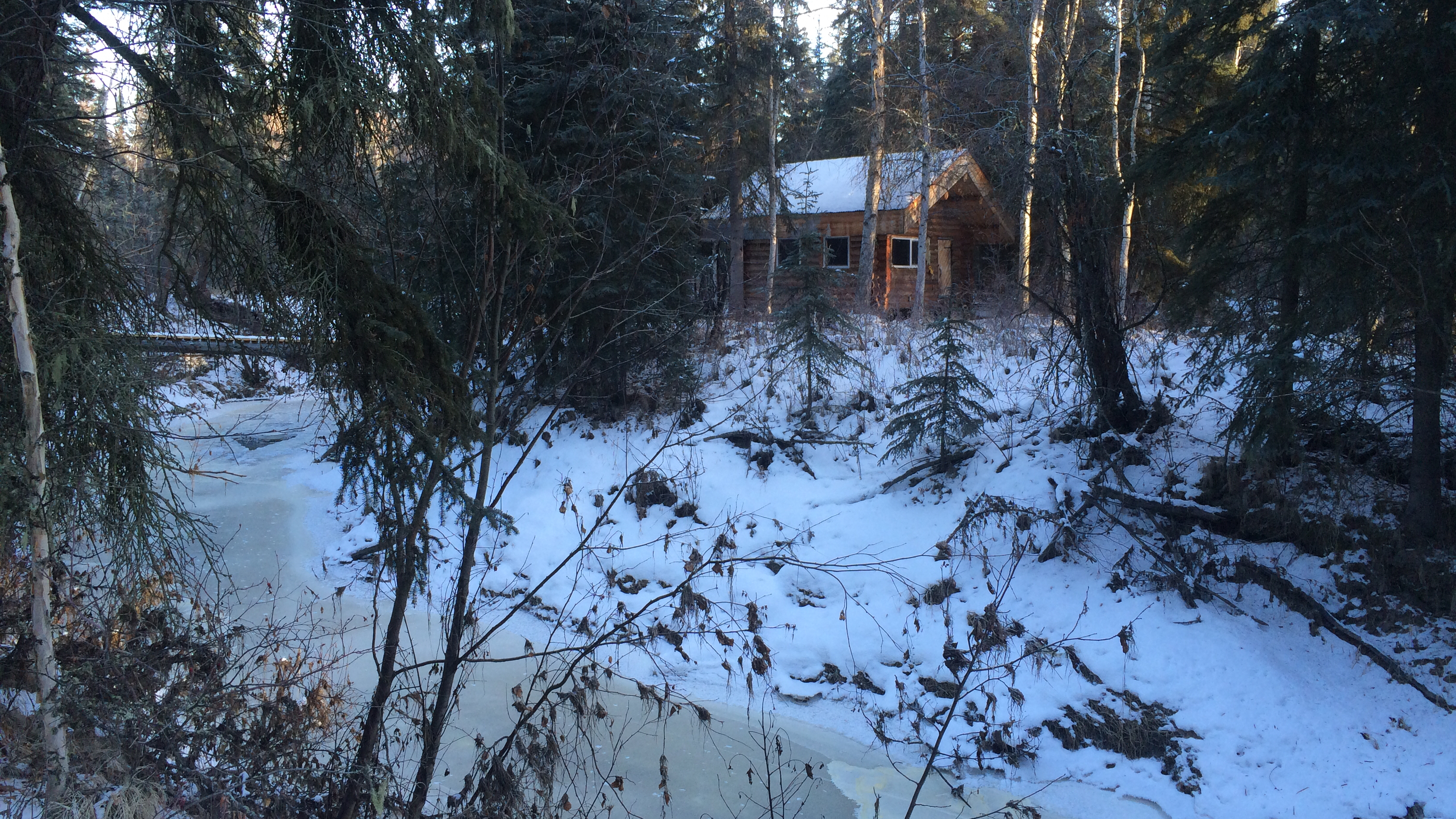
bridge and back cabin, low snow
Winter started off very early this year with the first snow falling on October 4th and 5th, setting a two inch base several weeks earlier than normal. Since then, we’ve had only two days with more than a trace of snow.
This seems to be a common pattern in Fairbanks. After the first snowfall and the establishment of a thin snowpack on the ground, we all get excited for winter and expect the early snow to continue to build, filling the holes in the trails and starting the skiing, mushing and winter fat biking season. Then, nothing.
Analysis
I decided to take a quick look at the pattern of snow depth at the Fairbanks Airport station to see how uncommon it is to only have two inches of snow this late in the winter (November 8th at this writing). The plot below shows all of the snow depth data between November and April for the airport station, displayed as box and whisker plots.
Here’s the SQL:
SELECT extract(year from dte) AS year,
       extract(month from dte) AS month,
       to_char(dte, 'MM-DD') AS mmdd,
       round(snwd_mm/25.4, 1) AS inches
FROM ghcnd_pivot
WHERE station_name = 'FAIRBANKS INTL AP'
    AND snwd_mm IS NOT NULL
    AND (extract(month from dte) BETWEEN 11 AND 12
         OR extract(month from dte) BETWEEN 1 AND 4);
If you’re interested in the code that produces the plot, it’s at the bottom of the post. If the plot doesn’t show up in your browser or you want a copy for printing, here’s a link to the PDF version.
Box and whisker plots
For those unfamiliar with these, they’re a good way to evaluate the range of data grouped by some categorical variable (date, in our case) along with details about the expected values and possible extremes. The upper and lower limit of each box show the ranges where 25—75% of the data fall, meaning that half of all observed values are within this box for each date. For example, on today’s date, November 8th, half of all snow depth values for the period in question fell between four and eight inches. Our current snow depth of two inches falls below this range, so we can say that only having two inches of snow on the ground happens in less than 25% of the time.
The horizontal line near the middle of the box is the median of all observations for that date. Median is shown instead of average / mean because extreme values can skew the mean, so a median will often be more representative of the most likely value. For today’s date, the median snow depth is five inches. That’s what we’d expect to see on the ground now.
The vertical lines extending above and below the boxes show the points that are within 1.5 times the range of the boxes. These lines represent the values from the data outside the most likely, but not very unusual. If you scan across the November to December portion of the plot, you can see that the lower whisker touches zero for most of the period, but starting on December 26th, it rises above zero and doesn’t return until the spring. That means that there have been years where there was no snow on the ground on Christmas. Ouch.
The dots beyond the whiskers are outliers; observations so far from what is normal that they’re exceptional and not likely to be repeated. On this plot, most of these outliers are probably from one or two exceptional years where we got a ton of snow. Some of those outliers are pretty incredible; consider having two and a half feet of snow on the ground at the end of April, for example.
Conclusion
The conclusion I’d draw from comparing our current snow depth of two inches against the boxplots is that it is somewhat unusual to have this little snow on the ground, but that it’s not exceptional. It wouldn’t be unusual to have no snow on the ground.
Looking forward, we would normally expect to have a foot of snow on the ground by mid-December, and I’m certainly hoping that happens this year. But despite the probabilities shown on this plot it can’t say how likely that is when we know that there’s only two inches on the ground now. One downside to boxplots in an analysis like this is that the independent variable (date) is categorical, and the plot doesn’t have anything to say about how the values on one day relate to the values on the next day or any date in the future. One might expect, for example, that a low snow depth on November 8th means it’s more likely we’ll also have a low snow depth on December 25th, but this data can’t offer evidence on that question. It only shows us what each day’s pattern of snow depth is expected to be on it’s own.
Bayesian analysis, “given a snow depth of two inches on November 8th, what is the likelihood of normal snow depth on December 25th”, might be a good approach for further investigation. Or a more traditional regression analysis examining the relationship between snow depth on one date against snow depth on another.
Appendix: R Code
library(RPostgreSQL)
library(ggplot2)
library(scales)
library(gtable)

# Build plot "table"
make_gt <- function(nd, jf, ma) {
    gt1 <- ggplot_gtable(ggplot_build(nd))
    gt2 <- ggplot_gtable(ggplot_build(jf))
    gt3 <- ggplot_gtable(ggplot_build(ma))
    max_width <- unit.pmax(gt1$widths[2:3], gt2$widths[2:3], gt3$widths[2:3])
    gt1$widths[2:3] <- max_width
    gt2$widths[2:3] <- max_width
    gt3$widths[2:3] <- max_width
    gt <- gtable(widths = unit(c(11), "in"), heights = unit(c(3, 3, 3), "in"))
    gt <- gtable_add_grob(gt, gt1, 1, 1)
    gt <- gtable_add_grob(gt, gt2, 2, 1)
    gt <- gtable_add_grob(gt, gt3, 3, 1)

    gt
}

drv <- dbDriver("PostgreSQL")
con <- dbConnect(drv, dbname="DBNAME")
results <- dbGetQuery(con,
                      "SELECT extract(year from dte) AS year,
                              extract(month from dte) AS month,
                              to_char(dte, 'MM-DD') AS mmdd,
                              round(snwd_mm/25.4, 1) AS inches
                       FROM ghcnd_pivot
                       WHERE station_name = 'FAIRBANKS INTL AP'
                           AND snwd_mm IS NOT NULL
                           AND (extract(month from dte) BETWEEN 11 AND 12
                                OR extract(month from dte) BETWEEN 1 AND 4);")
results$mmdd <- as.factor(results$mmdd)
# NOV DEC
nd <- ggplot(data=subset(results, month == 11 | month == 12), aes(x=mmdd, y=inches)) +
    geom_boxplot() +
    theme_bw() +
    theme(axis.title.x = element_blank()) +
    theme(plot.margin = unit(c(1, 1, 0, 0.5), 'lines')) +
    # scale_x_discrete(name="Date (mm-dd)") +
    scale_y_discrete(name="Snow depth (inches)", breaks=pretty_breaks(n=10)) +
    theme(axis.text.x = element_text(angle = 45, hjust = 1)) +
    ggtitle('Snow depth by date, Fairbanks Airport, 1917-2013')
# JAN FEB
jf <- ggplot(data=subset(results, month == 1 | month == 2), aes(x=mmdd, y=inches)) +
    geom_boxplot() +
    theme_bw() +
    theme(axis.title.x = element_blank()) +
    theme(plot.margin = unit(c(0, 1, 0, 0.5), 'lines')) +
    # scale_x_discrete(name="Date (mm-dd)") +
    scale_y_discrete(name="Snow depth (inches)", breaks=pretty_breaks(n=10)) +
    theme(axis.text.x = element_text(angle = 45, hjust = 1)) # +
    # ggtitle('Snowdepth by date, Fairbanks Airport, 1917-2013')
# MAR APR
ma <- ggplot(data=subset(results, month == 3 | month == 4), aes(x=mmdd, y=inches)) +
    geom_boxplot() +
    theme_bw() +
    theme(plot.margin = unit(c(0, 1, 1, 0.5), 'lines')) +
    scale_x_discrete(name="Date (mm-dd)") +
    scale_y_discrete(name="Snow depth (inches)", breaks=pretty_breaks(n=10)) +
    theme(axis.text.x = element_text(angle = 45, hjust = 1)) # +
    # ggtitle('Snowdepth by date, Fairbanks Airport, 1917-2013')

gt <- make_gt(nd, jf, ma)
svg("snowdepth_boxplots.svg", width=11, height=9)
grid.newpage()
grid.draw(gt)
dev.off()

back cabin during the flood
The summer of 2014 will be remembered by most Fairbanksans as the rainiest summer in memory, but for those living on Goldstream Creek, it marks the first time in at least 30 years that the Creek went over the banks. It started with completely saturated ground from near-continuous rain in late June and was followed by more than three inches of rain falling during a single 24-hour period on July 1st and 2nd.
By the evening of the 2nd, the Creek had risen to the banks, washed out our 18-year old log bridge, and eventually flooded our property to a depth requiring chest waders to make it out to the back cabin. It crested in the early morning hours of July 3rd, and took the entire day to return to the confines of the Creek bed.
Here are a few videos of the flooding, including one showing our bridge washing downstream in front of the back cabin.
Since the flood receded, we cleaned up the mess, repaired the foundation under the arctic entryway, and worked to raise the bridge and lift the back cabin higher off the ground so it is no longer in danger of being flooded in the next event.
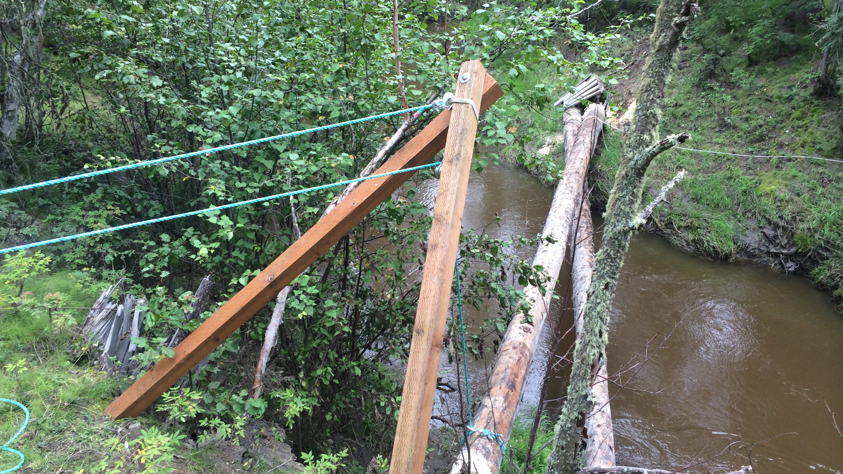
Raising the logs back up to the banks was an exercise in how to carefully lift and move very heavy things without an overhead crane. The technique is based on a pair of 4x4’s bolted together at the top to form an arch. The bipod sits on the bank and leans over the edge, with one rope winch keeping the bipod from falling into the Creek and another rope winch attached to the log through a pulley hanging from the top of the bipod. For it to work, there needs to be a greater than 90° angle at the pulley so that the action of tightening the rope connected to the load will pull the top of the bipod down (but instead, lifts the end of the log). Here’s a photo taken during the first lift.
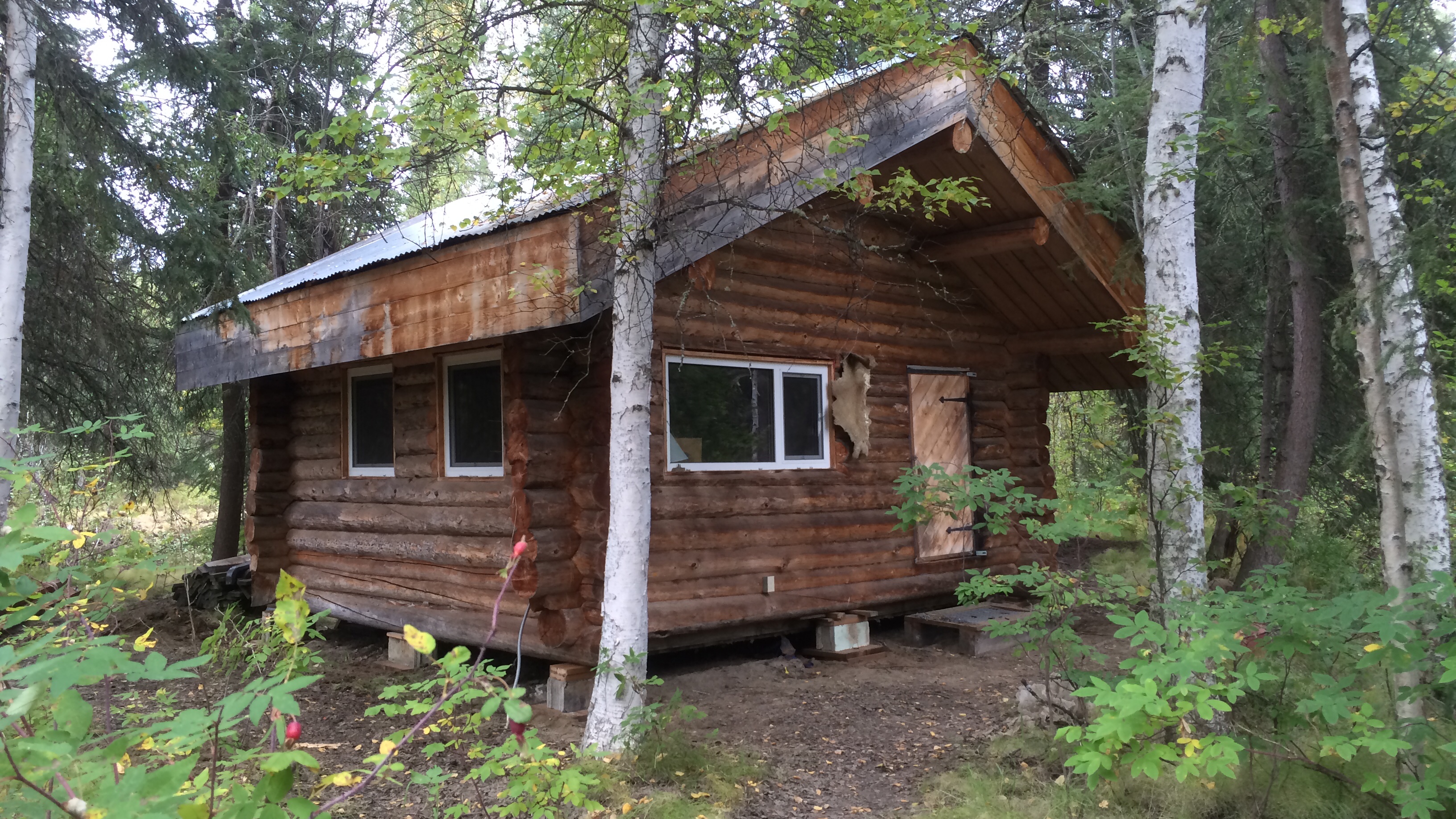
The cabin was lifted using a pair of “railroad jacks” on the ends of the bottom side logs. Amazingly, the entire cabin could be picked up from the very ends of the logs, and in two days we had the cabin up ten or eleven inches sitting on large pressure-treated pads.
Earlier this week we had another unprecedented rainstorm that dumped more than two inches of rain in less than 24 hours, breaking the daily record, and giving Fairbanks more than our average monthly rainfall for September in a single day. The following graph (PDF version) shows the water level in the Creek following the storm.
It took just over 24 hours for the flood to Crest, and then another three days to come back down to the level it was before the storm. We observed a similar pattern in the July flooding event, but I can’t seem to find the notebook where I recorded the heights (and then depths once it was over the banks). It is quite remarkable how quickly the water rises once it begins; when we got home from work on July 2nd and the water was only a third of the way across the dog yard, I still thought the water would be contained. But it continued rising and rising. It will be interesting to compare the pattern from July to September if I can find those numbers. Having a sense of what we can expect from the Creek when we get a big rainstorm is very valuable information.
Equinox Marathon finish
It’s the beginning of a new year and time for me to look back at what I learned last year. Rather than a long narrative, let’s focus on the data. The local newspaper did a “community profile” of me this year and it was focused on my curiosity about the world around us and how we can measure and analyze it to better understand our lives. This post is a brief summary of that sort of analysis for my small corner of the world in the year that was 2013.
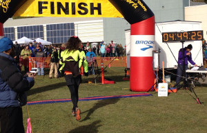
Exercise
2013 was the year I decided to, and did, run the Equinox Marathon, so I spent a lot of time running this year and a lot less time bicycling. Since the race, I’ve been having hip problems that have kept me from skiing or running much at all. The roads aren’t cleared well enough to bicycle on them in the winter so I got a fat bike to commute on the trails I’d normally ski.
Here are my totals in tabular form:
| type | miles | hours | calories |
|---|---|---|---|
| Running | 529 | 89 | 61,831 |
| Bicycling | 1,018 | 82 | 54,677 |
| Skiing | 475 | 81 | 49,815 |
| Hiking | 90 | 43 | 18,208 |
| TOTAL | 2,113 | 296 | 184,531 |
I spent just about the same amount of time running, bicycling and skiing this year, and much less time hiking around on the trails than in the past. Because of all the running, and my hip injury, I didn’t manage to commute to work with non-motorized transport quite as much this year (55% of work days instead of 63% in 2012), but the exercise totals are all higher.
One new addition this year is a heart rate monitor, which allows me to much more accurately estimate energy consumption than formulas based on the type of activity, speed, and time. Riding my fat bike, it’s pretty clear that this form of travel is so much less efficient than a road bike with smooth tires that it can barely be called “bicycling,” at least in terms of how much energy it takes to travel over a certain distance.
Here’s the equations from Keytel LR, Goedecke JH, Noakes TD, Hiiloskorpi H, Laukkanen R, van der Merwe L, Lambert EV. 2005. Prediction of energy expenditure from heart rate monitoring during submaximal exercise. J Sports Sci. 23(3):289-97.
where
- hr = Heart rate (in beats/minute)
- w = Weight (in pounds)
- a = Age (in years)
- t = Exercise duration time (in hours)
And a SQL function that implements the version for men (to use it, you’d replace
the nnn and yyyy-mm-dd with the appropriate values for you):
--- Kcalories burned based on average heart rate and number
--- of hours at that rate.
CREATE OR REPLACE FUNCTION kcal_from_hr(hr numeric, hours numeric)
RETURNS numeric
LANGUAGE plpgsql
AS $$
DECLARE
    weight_lb numeric := nnn;
    resting_hr numeric := nn;
    birthday date := 'yyyy-mm-dd';
    resting_kcal numeric;
    exercise_kcal numeric;
BEGIN
    resting_kcal := ((-55.0969+(0.6309*(resting_hr))+
                    (0.0901*weight_lb)+
                    (0.2017*(extract(epoch from now()-birthday)/
                    (365.242*24*60*60))))/4.184)*60*hours;
    exercise_kcal := ((-55.0969+(0.6309*(hr))+
                     (0.0901*weight_lb)+
                     (0.2017*(extract(epoch from now()-birthday)/
                     (365.242*24*60*60))))/4.184)*60*hours;
    RETURN exercise_kcal - resting_kcal;
END;
$$;
Here’s a graphical comparison of my exercise data over the past four years:
It was a pretty remarkable year, although the drop in exercise this fall is disappointing.
Another way to visualize the 2013 data is in the form of a heatmap, where each block represents a day on the calendar, and the color is how many calories I burned on that day. During the summer you can see my long runs on the weekends showing up in red. Equinox was on September 21st, the last deep red day of the year.
Weather
2013 was quite remarkable for the number of days where the daily temperature was dramatically different from the 30-year average. The heatmap below shows each day in 2013, and the color indicates how many standard deviations that day’s temperature was from the 30-year average. To put the numbers in perspective, approximately 95.5% of all observations will fall within two standard deviations from the mean, and 99.7% will be within three standard deviations. So the very dark red or dark blue squares on the plot below indicate temperature anomalies that happen less than 1% of the time. Of course, in a full year, you’d expect to see a few of these remarkable differences, but 2013 had a lot of remarkable differences.
2013 saw 45 days where the temperature was more than 2 standard deviations from the mean (19 that were colder than normal and 26 that were warmer), something that should only happen 16 days out of a normal year [ 365.25(1 − 0.9545) ]. There were four days ouside of 3 standard deviations from the mean anomaly. Normally there’d only be a single day [ 365.25(1 − 0.9973) ] with such a remarkably cold or warm temperature.
April and most of May were remarkably cold, resulting in many people skiing long past what is normal in Fairbanks. On May first, Fairbanks still had 17 inches of snow on the ground. Late May, almost all of June and the month of October were abnormally warm, including what may be the warmest week on record in Alaska from June 23rd to the 29th. Although it wasn’t exceptional, you can see the brief cold snap preceding and including the Equinox Marathon on September 21st this year. The result was bitter cold temperatures on race day (my hands and feet didn’t get warm until I was climbing Ester Dome Road an hour into the race), as well as an inch or two of snow on most of the trail sections of the course above 1,000 feet.
Most memorable was the ice and wind storm on November 13th and 14th that dumped several inches of snow and instantly freezing rain, followed by record high winds that knocked power out for 14,000 residents of the area, and then a drop in temperatures to colder than ‒20°F. My office didn’t get power restored for four days.
git
I’m moving more and more of my work into git, which is a distributed revision control system (or put another way, it’s a system that stores stuff and keeps track of all the changes). Because it’s distributed, anything I have on my computer at home can be easily replicated to my computer at work or anywhere else, and any changes that I make to these files on any system, are easy to recover anywhere else. And it’s all backed up on the master repository, and all changes are recorded. If I decide I’ve made a mistake, it’s easy to go back to an earlier version.
Using this sort of system for software code is pretty common, but I’m also using
this for normal text files (the docs repository below), and have
starting moving other things into git such as all my eBooks.
The following figure shows the number of file changes made in three of my
repositories over the course of the year. I don’t know why April was such an
active month for Python, but I clearly did a lot of programming that month. The
large number of file changes during the summer in the docs repository is
because I was keeping my running (and physical therapy) logs in that repository.
Dog Barn
The dog barn was the big summer project. It’s a seven by eleven foot building with large dog boxes inside that we keep warm. When the temperatures are too cold for the dogs to stay outside, we put them into their boxes in the dog barn and turn the heat up to 40°F. I have a real-time visualization of the conditions inside and outside the barn, and because the whole thing is run with a small Linux computer and Arduino board, I’m able to collect a lot of data about how the barn is performing.
One such analysis will be to see how much heat the dogs produce when they are in the barn. To estimate that, we need a baseline of how much heat we’re adding at various temperatures in order to keep it at temperature. I haven’t collected enough cold temperature data to really see what the relationship looks like, but here’s the pattern so far.
The graph shows the relationship between the temperature differential between the outside and inside of the barn plotted against the percentage of time the heater is on in order to maintain that differential, for all 12-hour periods where the dogs weren’t in the barn and there’s less than four missing observations. I’ve also run a linear and quadratic regression in order to predict how much heat will be required at various temperature differentials.
The two r2 values shows how much of the variation in heating is explained by the temperature differential for the linear and the quadratic regressions. I know that this isn’t a linear relationship, but that model still fits the data better than the quadratic model does. It may be that it’s some other form of non-linear relationship that’s not well expressed by a second order polynomial.
Once we can predict how much heat it should take to keep the barn warm at a particular temperature differential, we can see how much less heat we’re using when the dogs are in the barn. One complication is that the dogs produce enough moisture when they are in the barn that we need to ventilate it when they are in there. So in addition to the additive heating from the dogs themselves, there will be increased heat losses because we have to keep it better ventilated.
It’ll be an interesting data set.
Power
Power consumption is a concern now that we’ve set up the dog barn and are keeping it heated with an electric heater. It’s an oil-filled radiator-style heater, and uses around 1,100 Watts when it’s on.
This table shows our overall usage by year for the period we have data.
| year | average watts | total KWH |
|---|---|---|
| 2010 | 551 | 4822 |
| 2011 | 493 | 4318 |
| 2012 | 433 | 3792 |
| 2013 | 418 | 3661 |
Our overall energy use continues to go down, which is a little surprising to me, actually, since we eliminated most of the devices known to use a lot electricity (incandescent light bulbs, halogen floodlights) years ago. Despite that, and bringing the dog barn on line in late November, we used less electricity in 2013 than in the prior three years.
Here’s the pattern by month, and year.
The spike in usage in November is a bit concerning, since it’s the highest overall monthly consumption for the past four years. Hopefully this was primarily due to the heavy use of the heater during the final phases of the dog barn construction. December wasn’t a particularly cold month relative to years past, but it’s good to see that our consumption was actually quite low even with the barn heater being on the entire month.
That wraps it up. Have a happy and productive 2014!
The list of books for the 2014 Tournament of Books has been released. Once again, I plan to keep the list up to date with what I’ve read and whether I thought each book is good enough to win. One star (☆) means I didn’t like it but managed to finish it, two stars (☆☆) means I liked it but I didn’t think it should win, and three stars (★★★) means it was one of the better books I read this (or last) year and I’d be happy if it won the Tournament. The last several years my personal favorites going into the contest have been eliminated, but thus far I haven’t been disappointed with the eventual winner.
- At Night We Walk in Circles by Daniel Alarcón
- The Luminaries by Eleanor Catton
- The Tuner of Silences by Mia Couto
- The Signature of All Things by Elizabeth Gilbert
- How to Get Filthy Rich in Rising Asia by Mohsin Hamid
- The Dinner by Herman Koch
- The Lowland by Jhumpa Lahiri
- Long Division by Kiese Laymon
- The Good Lord Bird by James McBride
- Hill William by Scott McClanahan ☆☆
- The Son by Philipp Meyer
- A Tale for the Time Being by Ruth Ozeki ☆☆
- Eleanor & Park by Rainbow Rowell
- The Goldfinch by Donna Tartt
- The People in the Trees by Hanya Yanagihara ☆☆
- Pre-Tournament Playoff winner
Pre-Tournament Playoff Round
- Life After Life by Kate Atkinson ★★★
- Woke Up Lonely by Fiona Maazel ☆☆
I’ve got a lot of reading to do between now and March, since I’ve only read two of the seventeen books chosen. Some seem like pretty obvious choices, but at least half of them are unfamiliar to me. And I just started reading The Flamethrowers, so I can’t even start on these until I’m done with that book. The good news is that all of them are available as eBooks from my local bookseller (Gulliver’s Books). That probably means they are in Amazon’s Kindle library as well.
Start reading!